Terrain is everything – Sanctum Imperialis – TO DONE!

Aah the Sanctum Imperalis… It’s taken a while to get the opportunity to take pictures but I needed some to add to last season’s hobby review.

It’s a big piece and so it’s a struggle to fit it into my homemade light box but I got there in the end.
As you may recall this was a project not without challenges, in particular the ‘bold’ choice of full verdigris on buttresses, supports and skirting boards.
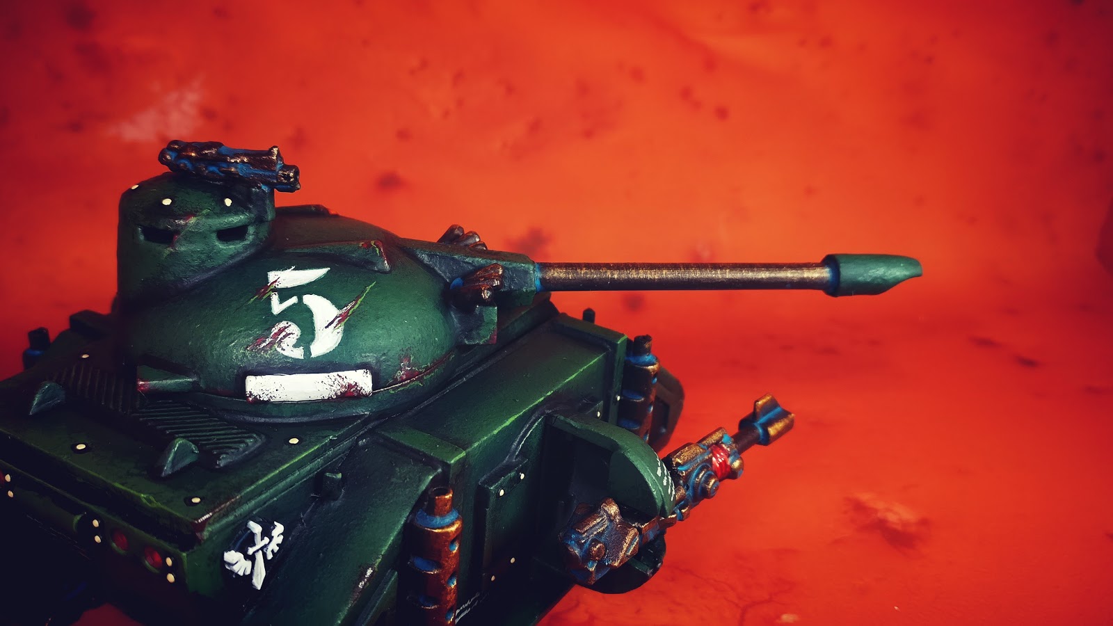
The red glass lighting also suffered from a lack of contrast that I repeated on my Ravenwing Dark Shroud – sometimes Tamiya Clear Red X-27 is too good.
But the colour choices were made to stretch me, to do something more challenging than just the weathered brassy bronze and as you can see the Ferron Proxima background finally gives it the context it needed.
On the full red/orange background the verdigris provides the ideal framework to break up the monotony of the red rockcrete walls.
With the cream interior adding another dimension.
I can’t wait to eventually see these used on my Realm of Battle board, although that could be a long time hence.
I had plans to add some creeping yellow flock up the walls and around the buttresses but didn’t get round to it.
I did get the occasional propaganda poster in though 😉
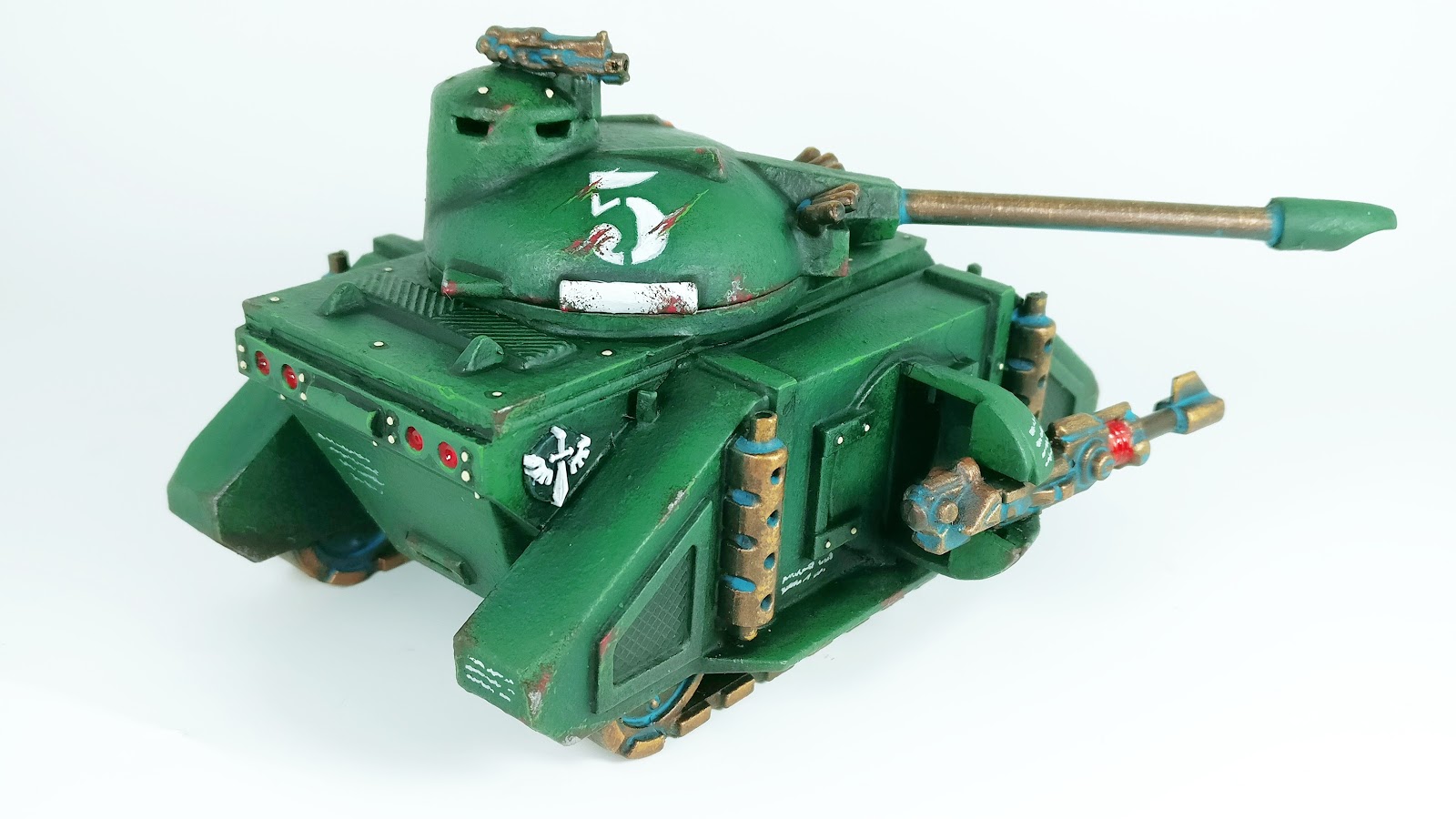
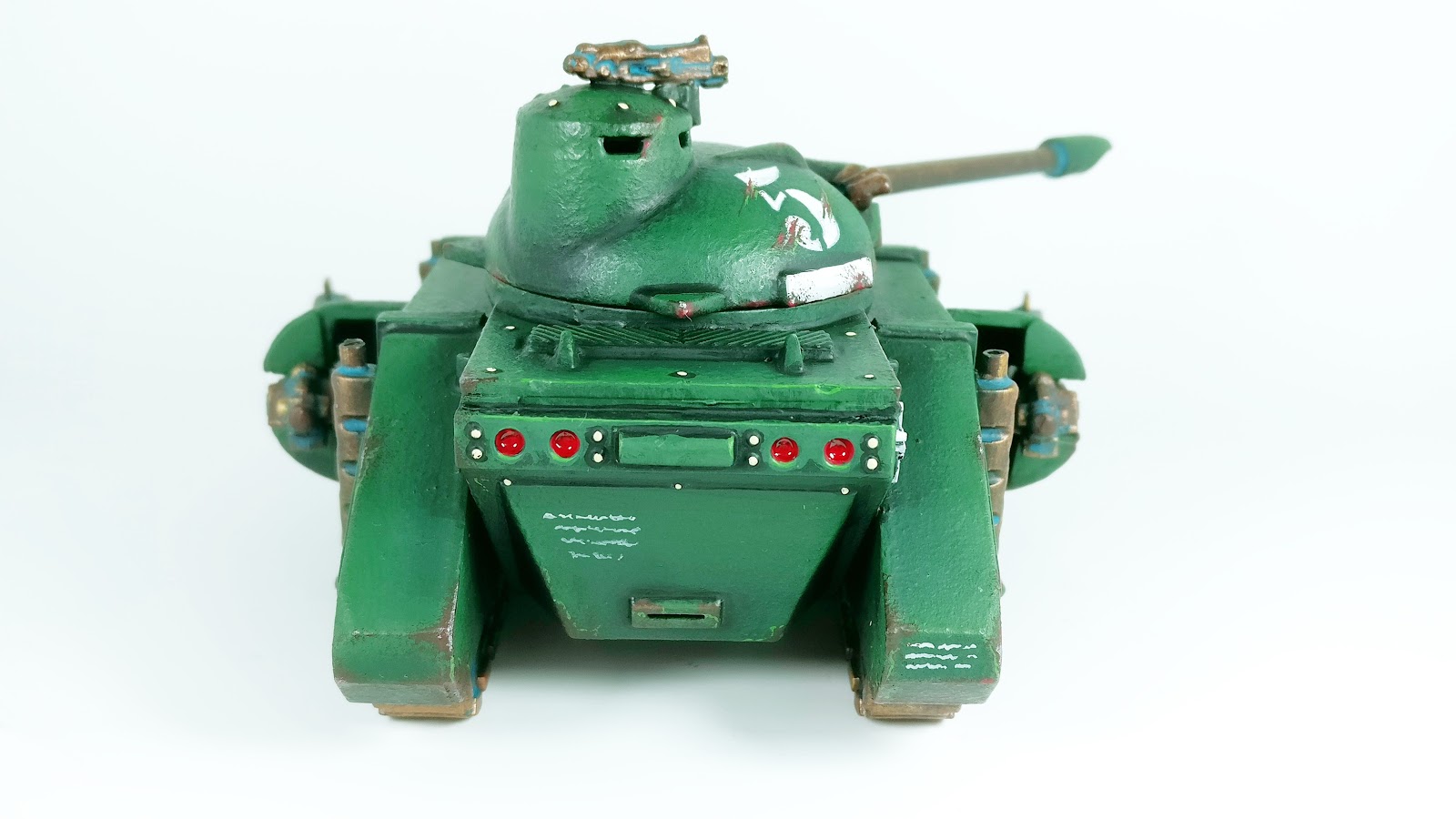
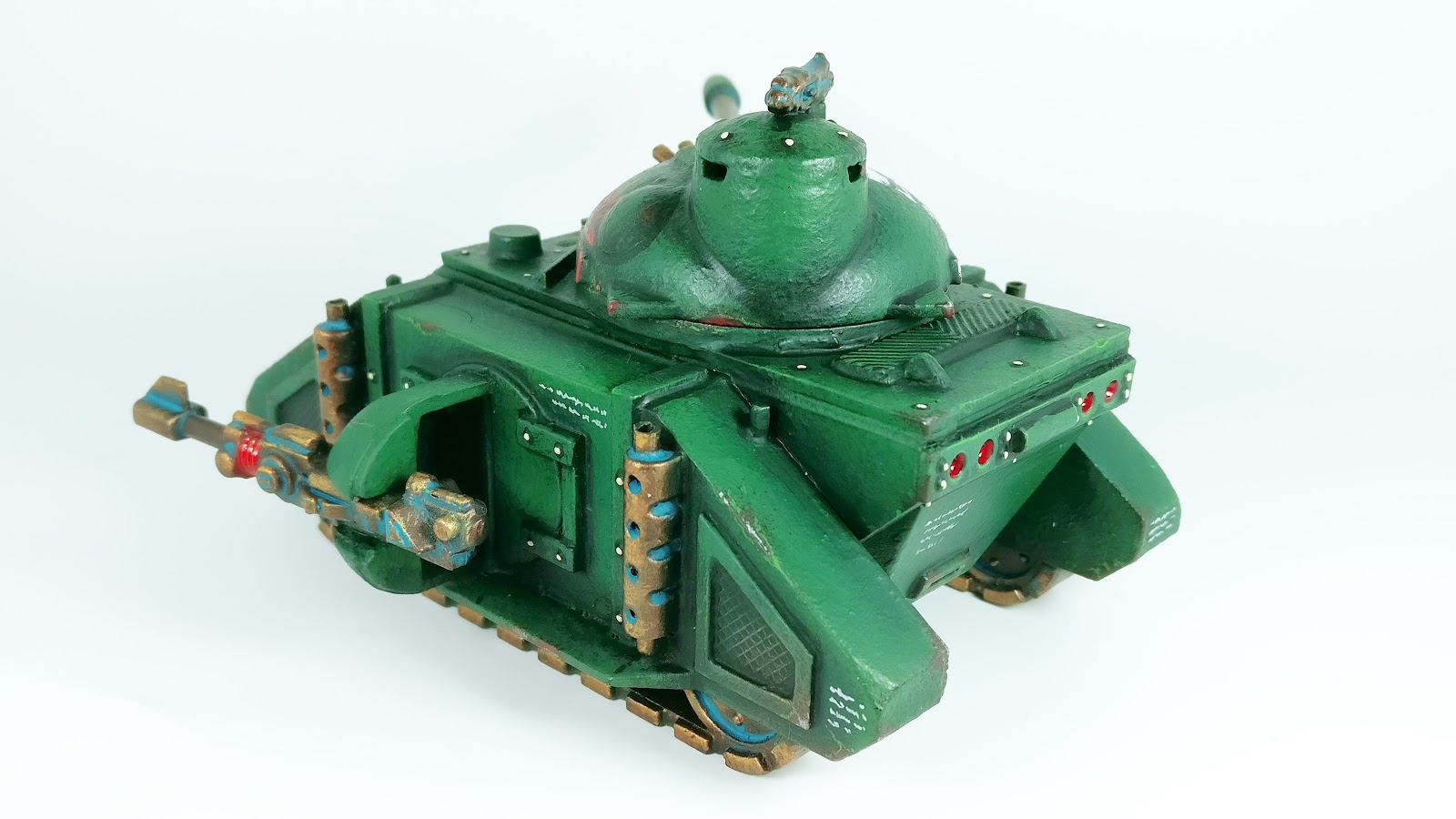
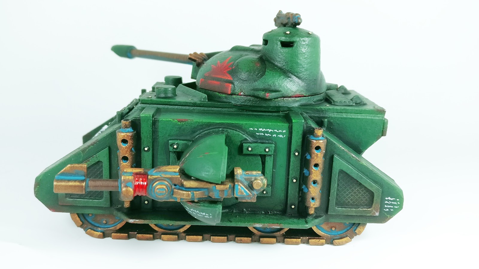
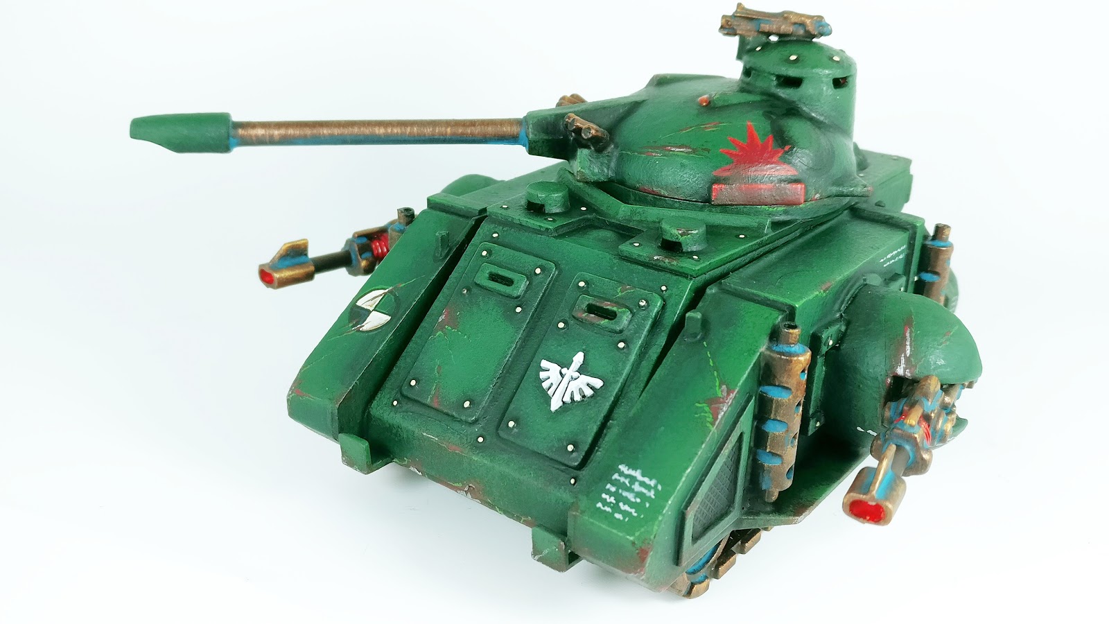
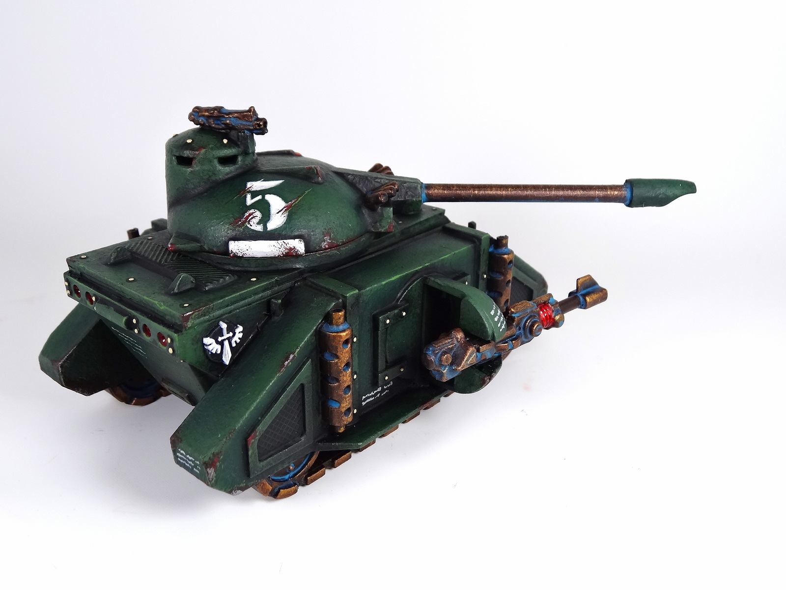
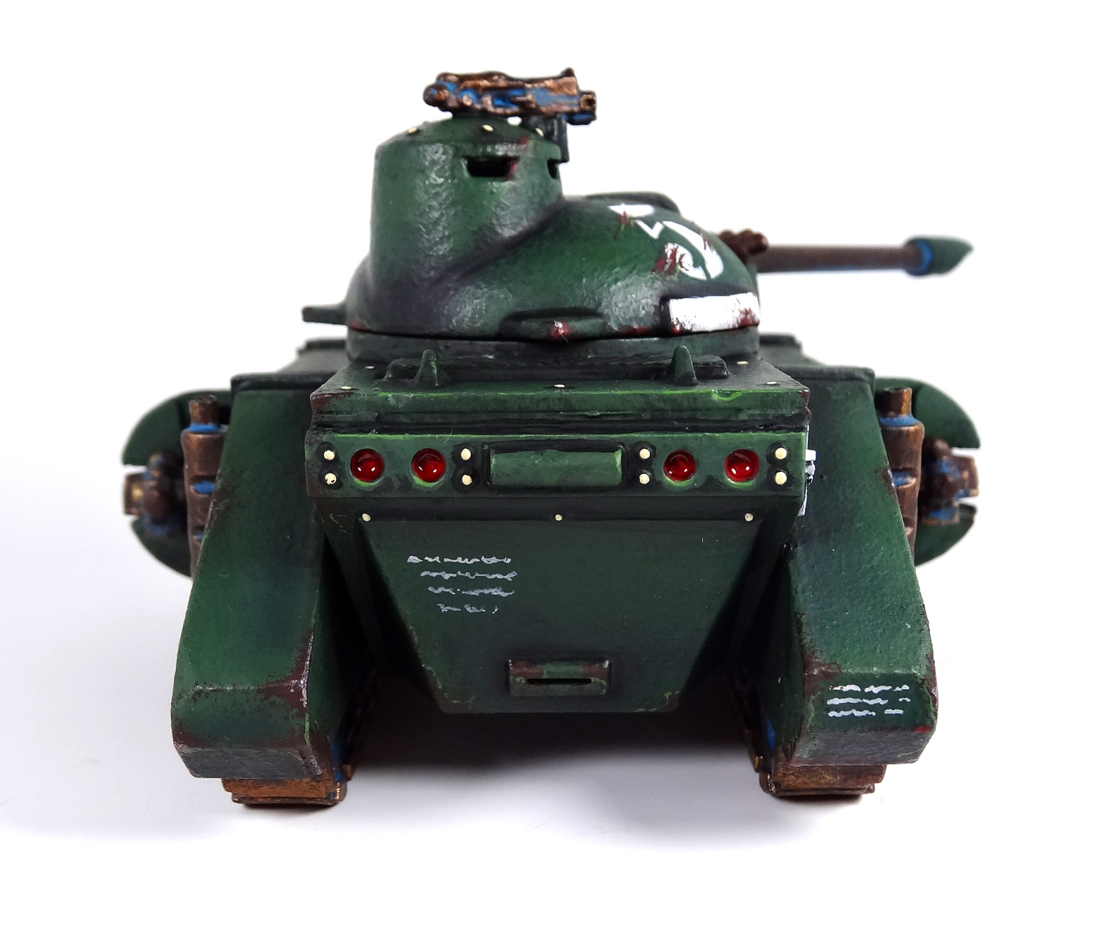
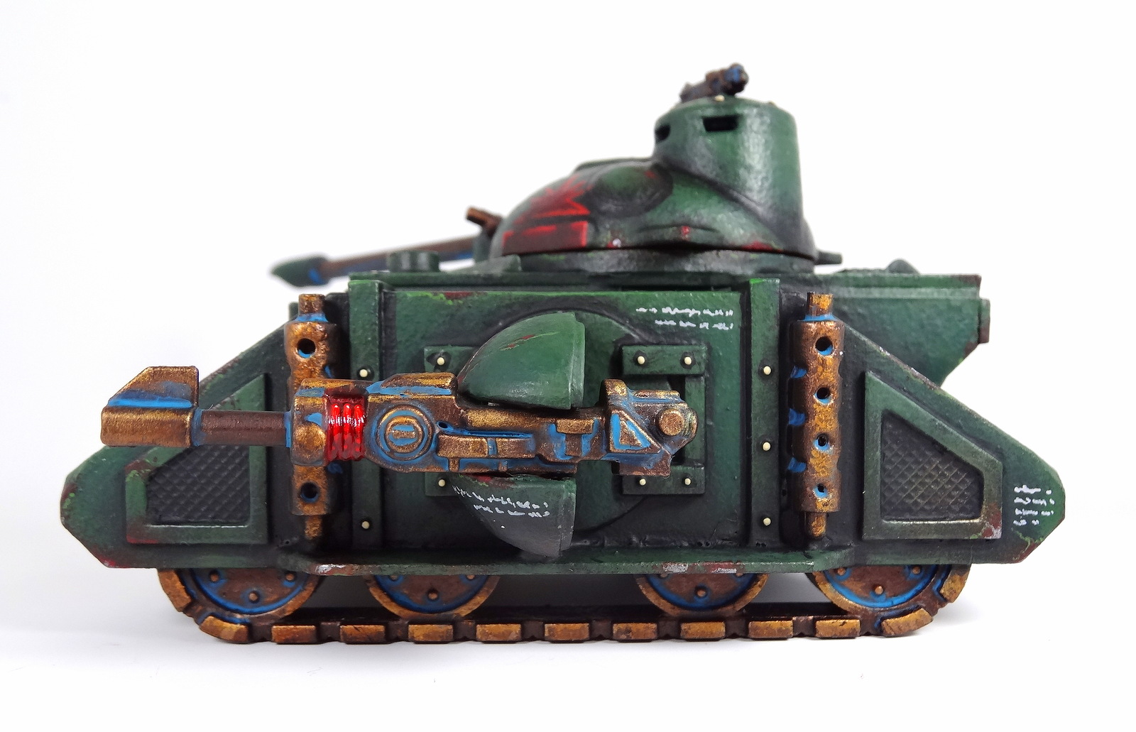
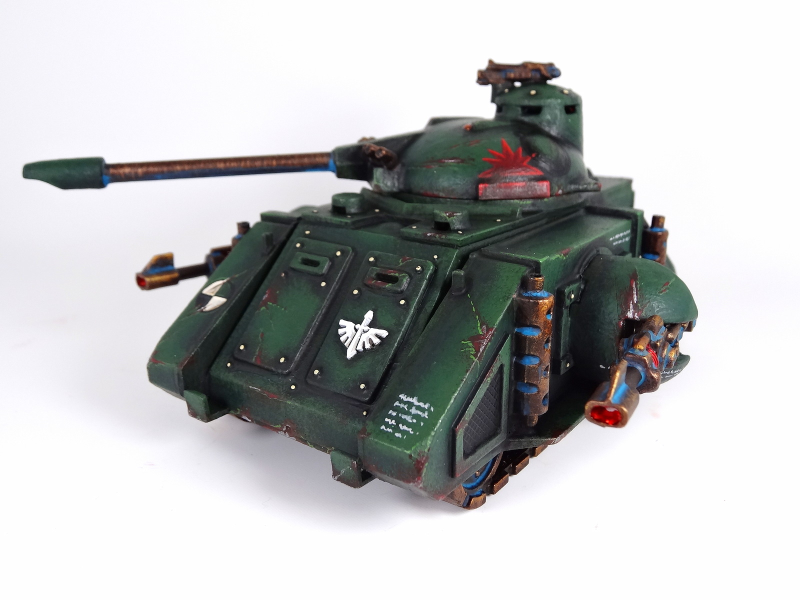
And the white background pics, which aren’t totally without merit.
At least it matches the interior a bit, there’s consistency and sense of reason that grounds the turquoise.
But as I’ve maintained buildings in real life are not always colour-matched and consistent.
They often have elements that are incongruous and garish. So whatever the result I committed to the aesthetic and executed it.
Better late than never the [last] Big Teal Stamp of Approval for 2018/19 and completing some terrain!

Dark Angels – Ravenwing Dark Shroud part 10 – TO DONE!

And here we are the Ravenwing Dark Shroud is complete. I think I’m satisfied with the result. As usual there are elements that exceed my expectations while there are others that fall short, or are compromised.

But I’m not overly fussed about the result, which I appreciate sounds a little underwhelming. This is a model I need in my army to make the Ravenwing more effective. Their function/inclusion is a key element of taking Ravenwing so he had to be done.
And the result matches my existing Ravenwing so all those boxes are ticked. The black highlights are exactly as expected which is good but as predicted the varnish did show up some brush strokes, but I’ll not lose sleep over them.
Almost everything else went to plan, although I didn’t take any pictures with the plasma battery.
The red glass windows are another area that falls a little short. A lot of the preparatory shading/highlights have been neutralized by the Tamiya Clear Red X-27, which is a shame. 
I should probably go super contrast next time, probably not even bother with reds, just do pure black and white.
I’ll probably use the Heavy Bolter more than the Assault Cannon, but it fits best with the magnets and because I cut off a bit of the rail mounting for the HB which makes it a little unstable 😦
2 other elements I’m unsure on – the red edging on the DJ booth. It was just ‘plonked’ on and I can’t tell if it looks it or somehow ties it altogether. 
I’m also sceptical regarding the purity seals and parchment. My other Land Speeders had a sepia tint on them which looked really cool. 
I don’t know whether leaving these pure white keeps the palette reduced or makes them stick out unrealistically?
The Ferron Marble was just as I’d done before but appears a little ‘busy’ after trying to compress so many veins into such a small space. But I’m not sure what else I could have done.
I know a lot of people dislike the design of this model and I wouldn’t say I’m a ‘fan’ but I do like certain elements [although this is perhaps its least flattering angle…]
Whereas the 3/4 view isn’t too bad and I do like the DJ booth. That’s why I had to get one of the old ‘Crayola’ Whirlwind launchers, so the deign aesthetic makes sense – 2 DJ bopoths. 
I was surprisingly pleased with the crew. They felt like an annoyance throughout as I kept missing metallic trim and having to repeat steps I’d already moved on from. They’re also much smaller pieces than the rest of the model so the sense of scale was difficult to reconcile.
But they all came out OK, with enough unique touches to make them out separately. Job done!
And the Big Teal Stamp of Approval for completing this ‘Darn’ [sic] Shroud!

Dark Angels – Tanks – Predator – Moar pics

I occassionally question the validity of taking these ‘moar’ shots but the Veliva filter often helps create the pictures I use most often to share what I’ve done on forums and social media.

I love the richness and high contrast, I can never quite tell which is the most accurate representation of the model, but these pics definitely made my Predator look cool.

Which might suggest these aren’t the most representative of colours…

Regardless I love the results.

And I love the tank too. I perhaps would have liked some form of spiked ram at the front. Not sure where the original ended up. It’s fine without and I think the weathering on that leading edge is ‘neat’ but I just envisage these with something to run folk over with 😉

Company badge again was well executed. I could have gone with the stick on disc but I actually like how I’ve managed to make soemthing that could almost be a decal. If anyone ever asks then I’ll know the effort was justified.

Again the laser lenses just came out so well. They totally look like those glass electricity insulators and add that touch of colour.

The rear drop pod Chapter symbol – it does the job. The big number 5 though, yummy

Rear lights, perhaps could have done the two outer ones as indicators, which would have amused me.

Anda a minimal amount of devotional script and litany, just to break up the expanse.

And the slightly more understated verdigris, in the darker turquoise just seems right.

The Heavy Support symbol is OK, probably the least convincing addition for me but I don’t dislike it.

I’m pleased I didn’t go too OTT with the scratches and weathering, certainly not like Euronymous.

It’ll be cool to have this on the battlefield but I suspect it won’t last long against Ben’s own armoured division, sadly.

But love the fact it just looks like a WWII tank, which suggests I should probably be playing Bolt Action with them!

And the Camera360 pics on a white background, giving a different green altogether, make of these what you will…

Next up will be my 1984 Citadel Samurai, completed for the ‘Eavier Metal Facebook group competition. It’s far from winning standard but I just wanted to join in. Then its my old skool/nu skool Razorback and then time to take stock…

Dark Angels – Tanks – Predator – TO DONE!

It’s extremely difficult to express the feeling I got from completing this original Predator. Interestingly it’s only really at the end that I felt so moved by the fact this 25+ year old model has finally been painted.

I can’t recall whether it was late 80’s or early 90’s I picked this up but aroudn that time my Mum and Dad had a caravan and we would regularly have trips away. I recall this being purchased on one of those trips.

I have a vivid memory of opening it up in the back of the car as we drove around somewhere, possibly in Wales. I think we’d been to some shopping centre and I’d hunted down the nearest GW or hobby shop so I could make a purchase.

Now it’s complete, so many years later and although the textured paint effect looks both wholly appropriate and also like I don’t thin my paints and just slapped it on thick on top of an existing paint job I’ve somehow come to terms with it because it’s complete.

And aside from that issue I think the result is pretty good. Perhaps a bigger Chapter symbol would have been nice, the very small ones seem a little understated but also makes my armoured ‘wing’ stand out a little more.

I also toned down the patina and the las-cannon lense coils just came out so well with the Tamiya Clear Red X-27.

I’m just so pleased with it that although I like the current pattern of Rhino/Razorback/Predator I can’t imagine anything but original Deimos on my Dark Angels army.

Thanfully I’ve another Razorback to finish and the ‘Crayola’ Whirlwind.

I doubt I’ll repaint my ‘Number 13′ Rhino as I just don’t see the point at this stage. Fitting these tanks into my army is a challenge already so one complete 2018 Rhino/Razorback should be enough for my current needs.

Anyway, here are all the white background shots just to look at, no more chat.

And the Great Big Gamboge Stamp of Approval for a job well done.

‘nids part 243 – Genestealer Broodlord – TO DONE!

A week or so ago, in the midst of my malaise I conjured up the motivation to crack on with this guy and a couple of nights work was sufficient to fix the bits I wasn’t happy with and then varnish it.

I have a sneaking suspicion I may want to use this Broodlord more than the others, whether that comes to pass or not I don’t know but I find something appealing about him.

I now have the Triumvirate of the Hive and could add in the two ‘Broodlords in Body Warmers’ to have five!

And not to forget I have another Patriarch from my second Deathwatch Overkill box. I’m unsure what to do with him actually. I’m pretty certain I don’t need a sixth Broodlord and aside from the challenge of converting it to be posed on the ground and thus use the pipe elsewhere I can’t see a reason to keep it…

 But there’s no urgency to get rid so I’ll keep hold of it for now.

I was really chuffed how the base worked out on this guy and really handy to have it on the 40mm round base too.

 They make a nice trio
Here are the phone shots as well, I didn’t take too many pictures but these ones look fab.

And a couple suitable for use as desktop wallpapers should you feel so inclined.

And once again the three brothers

And so I get the Great Big Gamboge Stamp of Approval!

Blog at WordPress.com.

Up ↑

Design a site like this with WordPress.com
Get started